Internship specs
Visa - education portal
Role
Timeline
UX Designer
Worked with: PMs, designers, data specialists, leadership
Visa has a lot of B2B products. A lot. There was confusion around how they all worked, how they differed, and why they mattered across teams. Understanding was low -> work efficiency decreased.
My team and I built an end-to-end, desktop education portal to bridge this knowledge gap. After using this portal, employees indicated increased knowledge in product understanding, thus improved work efficiency and lower onboarding times.
*Some of the text on interfaces shown below have been altered to protect NDA.
May - Aug 2024
Tasks
Tools
Prototyping
Usability testing
Storytelling
User research
XF collaboration
Figma
Microsoft Suite
Powerpoint


Imagine a dozen of eggs


By themselves, the eggs would roll around, bump into each other, and perhaps make a mess. Our team built a carton for these eggs. If we replace "eggs" with "products" and "carton" with "interactive tool", that pretty much sums up my internship project at Visa this summer.
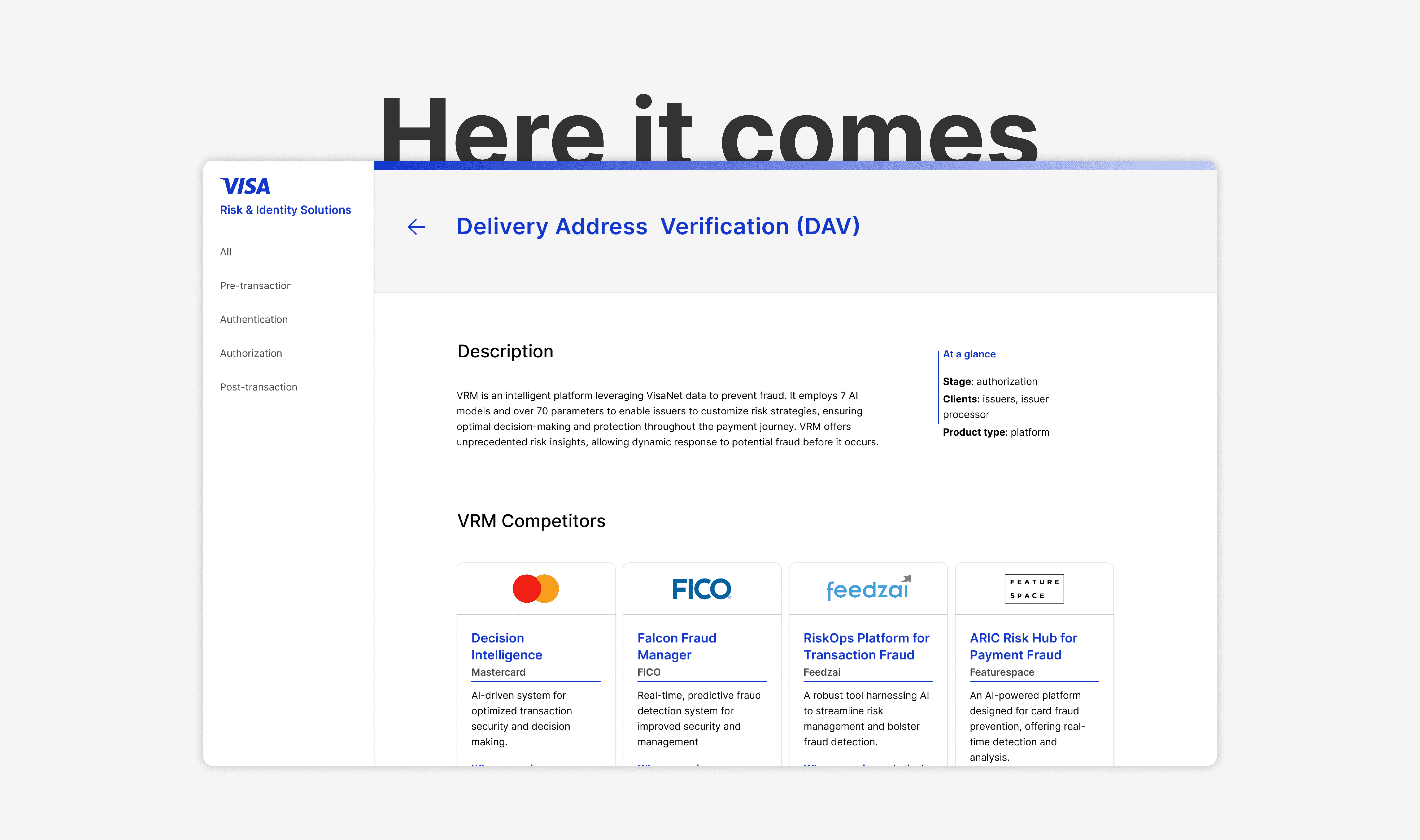
On the Risk & Identity Solutions team, I created an interactive desktop portal that categorizes 20+ Visa products, much like using a carton to organize a dozen of eggs.
Problem
Many products, limited understanding.
Visa employees are not aware of all the different risk and identity product. Even if they are, often times it is not clear how they fit together, what ways they are differentiated, and who our top competitors are in this space. Information that exists is often in different locations, or formatted in ways that make it difficult to digest at the right level.
There is a general lack of knowledge regarding these products, which can hinder work performance and possibly lead to lower B2B service conversion rates.
Context

10+ user interviews later
With any project, I start with questions.
What gap is there in product understanding?
How might this portal help employees perform tasks?
How does understanding vary depending on role?
Through informative interviews, I sought answer to these questions, which helped to clarify our goal. By defining project specs, we also prevented scope creep. The cross functional partners that I have interviewed and worked with include:
Designers
Product managers
Data specialists
Research
Research
Increase B2B product knowledge across xf teams
In a nutshell: help Visa employees understand 20+ B2B products better and faster so we can better serve our clients.
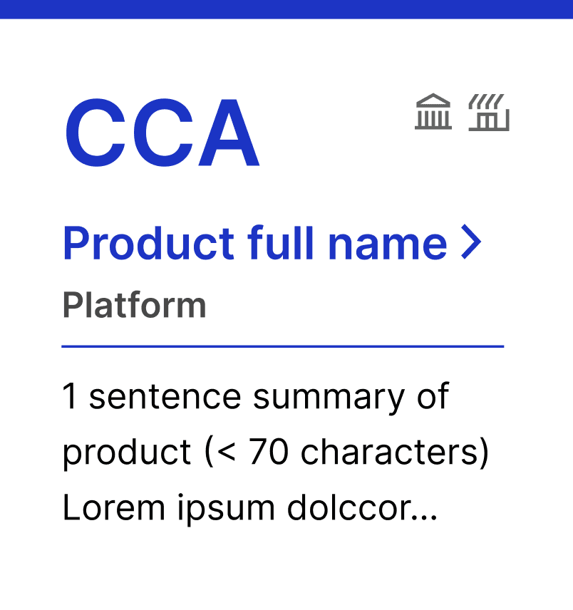
What this means: create an interactive education portal that walk through 20+ risk and identity products at a high level, indicating where they fit within the transaction flow, their key competitors, and the product type. The portal ensures a smooth, intuitive, and learning-oriented user experience for Visa employees across all functions.
Goal

Q: Why color code?
Design process
Let’s refer to science.
Studies have found that using colored icons in layouts yield higher search efficiency and better user experience (2022, Zhang).
For each Visa product, there are plenty of data to track: transaction stage, product type, clients served, etc. Color coding allows users to visually encode memories, which helps them quickly identify which transaction stage a product belongs to. These colors also align with Visa’s design system, ensuring brand integration and visual accessibility.

Pre-transaction
#1434CB
Authorization
#C9D2F9
Authentication
#FCC015
Post-transaction
#021E4C
How to balance info with UX?
Q:
Let’s decide with data.
Data partners hoped for more information on each product page. Design partners advocated for less clutter and better user experience.
By designing and A/B testing multiple options, we were able to find the “goldilocks” design that ensures both a pleasant user experience and informative learning experience. Decision matrices combined with usability testing are great tools for making difficult design decisions.
Good UX
ideal solutions
Poor UX
More data
Less data


Introducing - an interactive education portal
aka, a carton for the eggs.
1 - Simple, clear layout
Design solution

Easy access to relevant products
Clear nav
Potential problems
Educational
2 - Accessible design
Text count capped for readability

Icon for labeling
WCAG 2.2
3 - Smooth interactions

Test,
Do,
Learn,
Repeat.
Does it really work?
Testing
During 15 usability tests, I asked questions that answer a fundamental question: does this tool actually help employees learn faster? And if not, why?
Design is an iterative process. When in doubt, test it out.

Results
Faster onboarding.
Increased efficiency.
Better experience.
9.5/10
+60%
Learning satisfaction
Portal adoption rate
95%
Employee knowledge rate

Testimonials
POV: working with Phoebe


Product Director - Visa
Matthew Gulosh
Phoebe is a fast learner and a strong presenter. She takes constructive feedback well but also knows how to speak up and push back when she knows her ideas and expertise are warranted.

Data Director - Visa
Mykhailo Kashchenko
She exhibits excellent communication skills and has the ability to work effectively with various types of information. Phoebe quickly understands aim of project and gathers data from various groups.