Project specs
Book'em – Volunteer and Admin Portals
Role
Timeline
UX Design Lead
Worked with: engineering manager, PM, 5 developers
As part of Change++, I worked in a cross-functional team to design and ship volunteer and admin web portals for Book'em – a nonprofit that aims to improve youth literacy in Nashville.
As the sole designer, I planned out the information architecture, drafted the user flow, and created wireframes from scratch. I also gathered insights from 15 user surveys and iterated designs until we reached 95% stakeholder satisfaction.
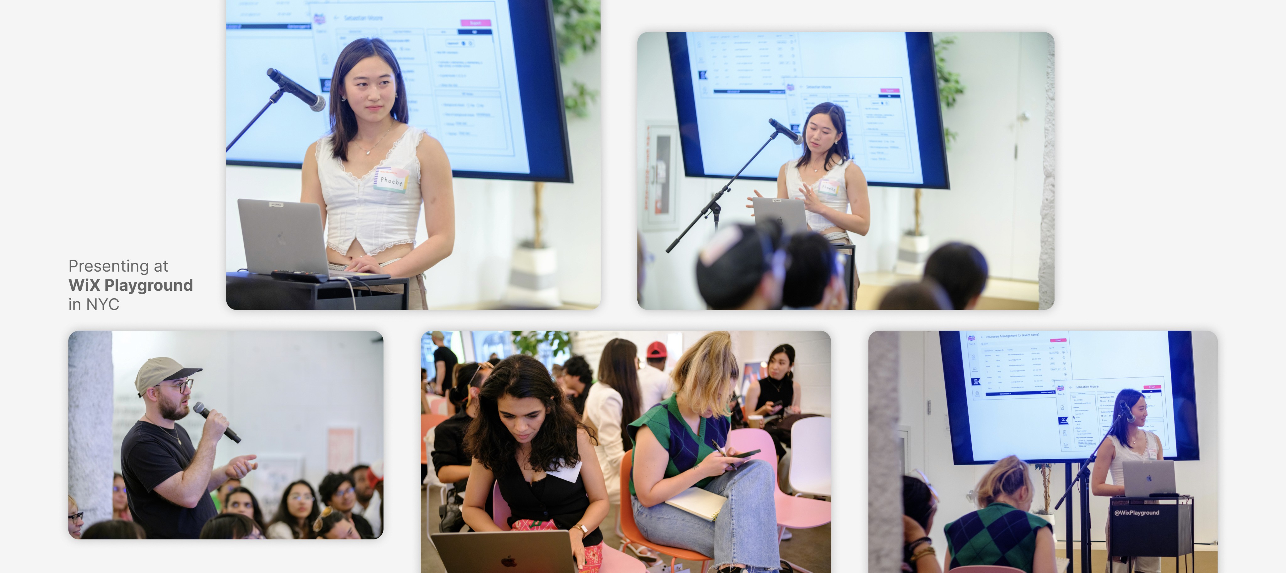
* Presented design at WiX Playground and implemented feedback from 50+ NYC designers.
Jan - May 2023
Tasks
Tools
Interaction design
User research
Usability testing
Presenting
Stakeholder-
communication
Figma
Google Forms

Who’s Book’em?
Book'em is a non-profit organization in Nashville, TN that aims to improve youth literacy and ignite children’s passion for reading through book ownership, educational programs, and volunteer opportunities.
They have distributed 194,000 books in 2021 and have become the largest provider of books for youth in Davidson County.
With the help of volunteers and admin, Book'em is able cultivate a more literate population in Nashville.
Context
Clarifying the plan with external clients
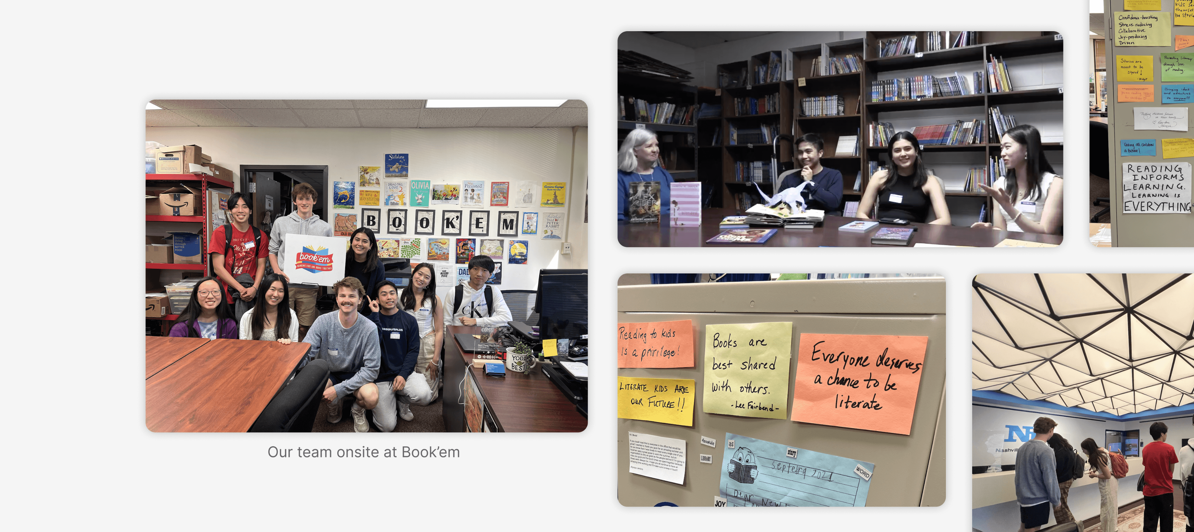
Our interaction with Book'em staff members did not stay within the bounds of Zoom calls. We visited them.
We met with Melissa, CEO of Book'em, as well as other members to pinpoint exactly what their concerns are and how we can help. Through our communication, we learned that Book'em has two core user groups
300+ community volunteers
20+ administrative staff members
Cross-functional collaboration meant working with both the internal development team and external stakeholders.
Research
Research
Too many data points. Not enough efficiency.
Problem


Redundant forms
Volunteers must fill out a different form for every Book'em event. This can become tedious.
No record of history
If volunteer hours weren't manually documented, they are essentially lost.
Scattered information
Admin find difficulty in keeping track of volunteers, events, and other logistical information.
"We've always had trouble managing our data & volunteer base. We were using five or six tools. I mean it worked, but not well."
– Melissa, CEO at Book'Em
Simplify onboarding + data management UX
Goal
We want to help the two user groups perform their tasks efficiently and easily. Volunteers should be able to contribute at Book'em without obstacles and admin should be able to facilitate this process effectively.
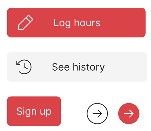
Reduce number of forms
Transparent numbers
A central source of truth
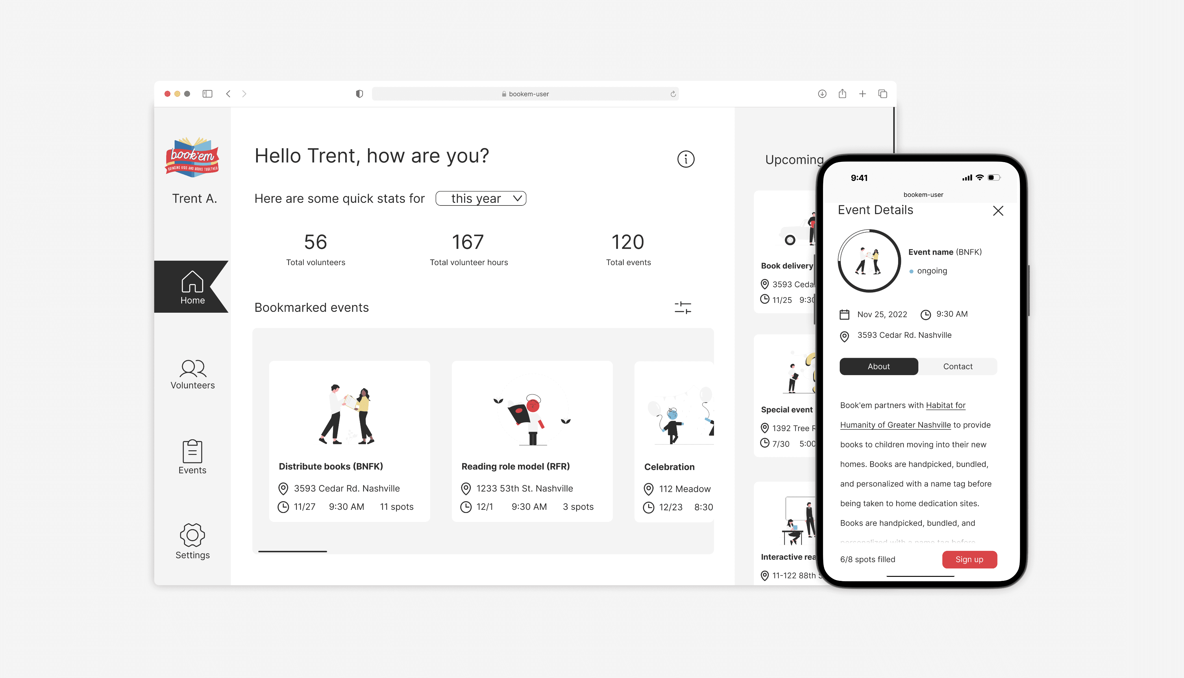
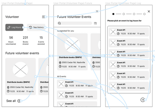
Book'em user flow
Prioritize
1 onsite visit, 4 Zoom calls, and a series of emails later, we learned about the obstacles at Book'em. However, within our strict timeline, we cannot solve all of them. We must prioritize. To decide on what to gear our solution towards, we based it on the most typical actions performed by volunteers and admin:
Volunteers
Sign-up for events --> fill out forms --> log hours --> learn and join future events.
Admin
Onboard new volunteers --> create new events --> keep track of records.
1 - Accessibility
A great majority of Book'em volunteers consist of middle-aged and seniors.
To ensure that the interface is accessible, I kept the font size large and the action buttons bold. The user journey is simple.

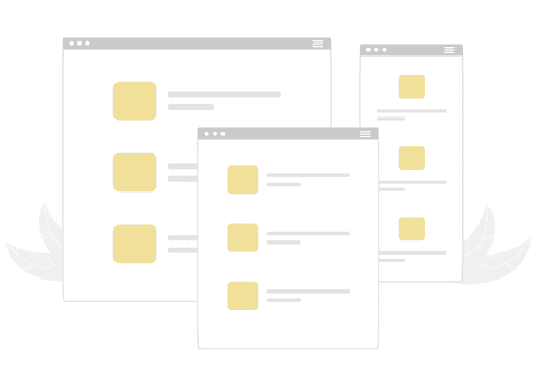
2 - Why icons?
Humans are visual creatures.
Iconography is an integral part of our design solution as it brings out a friendly, playful tone for Book'em and allows users to skim the interface and quickly find events.
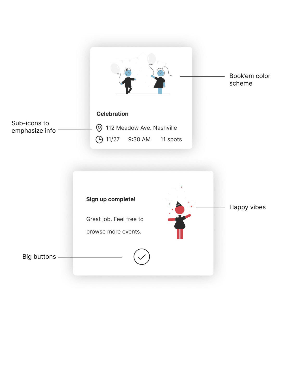
3 - Form design
There are A LOT of forms at Book'em. Our solution gets rid of duplicate forms and eases the form-filling process.
Progressive disclosure –introduce information across multiple screens to decrease cognitive load.

Testimonials
POV: working with Phoebe


Engineering Manager
Zi Teoh
Phoebe's curious inquiry has also been a blessing, as she is unafraid to ask questions to managers, developers, and stakeholders. These questions often helped us untangle the problem and better understand what we were seeking to build.

Software Engineer
Carol He
Her deep passion for design clearly shines through her work, and she is always looking for feedback and ways to improve her skills. It was always a pleasure to talk to and to work with Phoebe.


Introducing volunteer and admin web portals.
Design solution


Critique @ WiX
I sought feedback from 50+ designers – in graphics, UX, typology and beyond. For this experience, I am immensely grateful.
One line of feedback was regarding my use of icons. I iterated them to be simpler both to accommodate different screen sizes and also increase vision accessibility.
Adapt to change
Our interview with Melissa - Bookem CEO
Reflection
Tailored understanding
When I communicate design solutions to colleagues and clients, I empathize with both development and business perspectives and explain decisions with research, data, and transparency.
Be agile
In the industry, projects are almost never linear. At Book'em, we had to adapt to client requests but also prioritize necessary features.
Accessibility
All iterations, including those from WiX feedback, were geared towards greater accessibility. We ensure solutions are tailored for the user base, with the wide age range in mind


Results
Faster onboarding.
Easier data tracking.
Happy users.
Overcoming time & tech constraints
Obstacle
One challenge was the delay in user feedback. To combat this, I analyzed feedback on a rolling basis and iterated as soon as possible. I also guided stakeholders to understand the impact of their help and how it would inform design and development decisions.
With a tight technical budget, I worked closely with the product and engineering managers to create a feature prioritization list based on team constraints and user demand.
90%
Users found it easy to use the portals
15 surveys later...
Testing
I conducted usability testing with 15 Book'em users. Through this, we received information on what to iterate. Below are 3 topics that we learned more about, as well as the questions we asked to gain those insights.
Typography
"Is the text legible and easy to read?"
User flow
"Was the event sign up process confusing at any point?"
Prioritization
"Which page would you use most often and why?"
1 -> 2 -> 3
